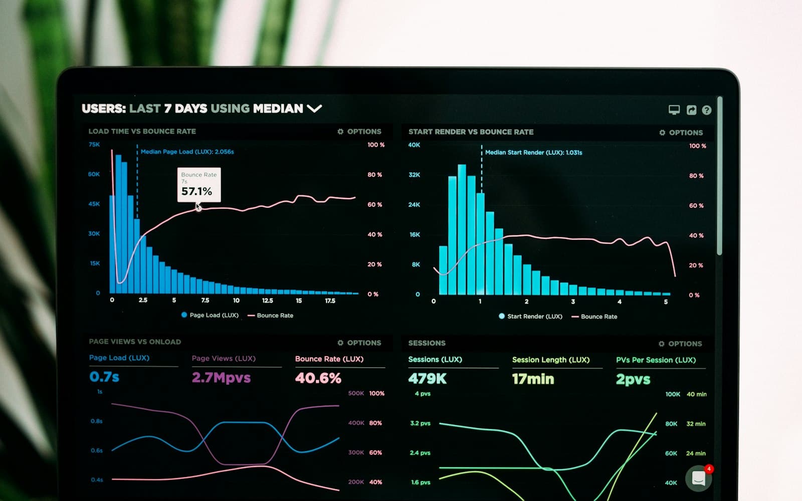
High-density work is not the opposite of good design. A dispatcher, analyst, or care coordinator needs a lot of information in view because the work changes quickly and context switching is costly.
The design problem is therefore not to remove data. It is to establish a stable reading order: primary state first, exceptions second, supporting details available without taking over the screen.
Typography, spacing, and contrast do much of this work. Repeated patterns make important values easy to locate, while quieter surfaces prevent secondary information from competing with urgent tasks.
Density becomes fatiguing when every element asks for equal attention. A system with deliberate hierarchy lets experienced operators move quickly without making new operators feel lost.
Key takeaways
- Density is not the problem by itselfExperienced users often need substantial information in view because context switching can slow operational work.
- Establish a stable reading orderPrimary state, exceptions, and supporting detail should have different visual weight rather than competing equally.
- Typography and spacing carry hierarchyRepeated patterns, contrast, and quieter secondary surfaces help users locate important values without unnecessary fatigue.